Writing an article can be tricky. And when you are given full liberty regarding the theme with nothing but “Design” as a guide, things can get out of control quickly. So my little Designer brain started thinking: I can’t write an article like this. I know it will be published in a company’s Medium (the same company I work for) but who reads the Medium? Because the target demographic for the Medium page sure is very different from the one that takes a look at our social media pages (and the Instagram public is other than the Twitter one) and might look a little bit more similar to the people that read newsletters (those still exist by the way).
But let’s forget for a minute the whole audience thing. What am I going to write about? Design is embracing. It’s everywhere. Should I choose the more general approach? Take a stab at some of the design concepts and deconstruct them? What if designers are reading or overall tech-savvy personnel who understand these concepts and would be bored to death?
The Designer’s ego
I should keep it simple but complex. You know, one of those pompous articles that go in-depth about the perfection of The Original Ice Cream Scoop designed by Sherman L. Kelly in 1935 and how perfect something so simple can be. An 18 cm cast of aluminium with a heat-conducting water solution inside that warms in the palm of your hand and then flows to the tip to allow you to scoop the perfect ball of ice cream. Isn’t design beautiful?
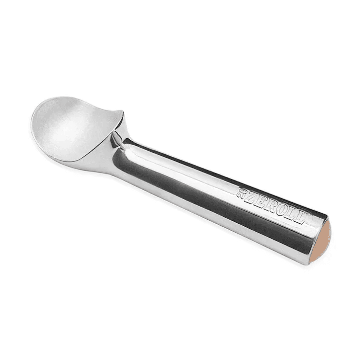
The Original Ice Cream Scoop — Sherman L. Kelly
Here is the thing about design: it’s a very personal subject. Some people like a particular work, and some don’t.
It is a bit like art! But different. Why? Because Design lives in purpose. Design is communication and has a primary objective: representing and having a single, correct and very thoughtful perspective and single viewpoint. Art is more open in that sense: when an artist creates a painting, music or a movie, it can have in mind a particular message that he wants to transmit, but it is ultimately open to interpretation. Design, mainly UI/UX can’t be available to multiple judgments, or it fails its purpose.
How can a design be better than another?
But how can design be evaluated? Who says that a purple button is worse than a blue one?
The answer might dwell in experience and testing. But first, some quick notions:
UI, or user interface design, focuses on a product’s visual and interactive elements, such as the layout, buttons, and menu options, and how they are arranged on the screen. It involves creating functional and aesthetically pleasing designs, making it easy for users to navigate and interact with a product or service.
UX, or user experience design, is a broader term that encompasses the entire experience of using a product or service, from when a user first encounters it to when they finish using it. It involves conducting research to understand the needs and goals of users and then using that information to design a product or service that is intuitive, easy to use and satisfying to interact with. UX designers often work closely with UI designers to create a cohesive and well-designed final product.
What’s the solution?
Evaluating something subjective can be challenging, as it involves making judgments about things open to interpretation or personal opinion. In general, it is crucial to approach the evaluation process with an open mind and to consider various factors when making your assessment. One of the main things to consider when preparing a design review is to get on multiple perspectives: it is essential to consider various perspectives and the different ways people might interpret or experience the work. This could include asking others for their opinions or seeking expert opinions to help you gain a more well-rounded view of the work.
A design can be considered better than another if it is more effective at achieving its intended goals. This could include being more aesthetically pleasing, user-friendly, functional, or innovative than the other design. Additionally, a design is better if it is more suitable for the specific context or purpose for which it was created or if it is more in line with the needs and preferences of the intended audience.
In general, it’s important to choose a font that is legible and easy to read while also fitting with the overall tone and aesthetic of the design. Let’s grab fonts, for example; the right font can help to create a cohesive look and feel for a design, while the wrong font can make a design look messy and unprofessional. Different fonts can also create other visual effects, so choosing a font that will help convey the design’s intended message is important. You wouldn’t select Comic Sans for a finance-related product.
Let’s talk colours!
The best colours to use for a platform can depend on the goals of the project and the intended audience: If the product represents a brand, consider using colours that are associated with the brand. For example, if the brand uses a specific shade of blue (like Ubiwhere), you may want to use that colour as a primary colour on your website.
Different colours can evoke different emotions and associations. For example, red can draw attention and convey a sense of urgency, while blue is often associated with trustworthiness and reliability.
Consider the purpose of your website and choose colours that align with that purpose. Use colour combinations effectively: Generally, it’s best to use a limited number of colours on your website (two to three is a good rule of thumb). Use these colours in a cohesive way, such as using a primary colour for headings and a secondary colour for accents. Avoid using too many different colours, as this can overwhelm users.
Keep accessibility in mind: Ensure that the colours you use have sufficient contrast, which is important for visual users. You can use a tool like the WebAIM Color Contrast Checker to ensure that your colour choices meet the recommended contrast ratios. (Don’t you ever dare to use white text on yellow).
Making it work
Design evaluation is a necessary process that helps ensure that a pr….

Check the full article on my medium